Type as a System of Play: Introducing a Geometric Deconstruction
I don’t know about you, but I spend most of my daily time scanning letterforms. We see words, language, and communication, but do we actually see them? They are functional vessels, workhorses designed to deliver meaning as efficiently as possible before disappearing into the background. With my latest project, I wanted to create a typeface that wasn't just read, but played with, a system that makes us stop and look closer. By exploring the tension between established letterforms and elementary geometric shapes, it breaks down the familiar architecture of language to uncover its fundamental components.
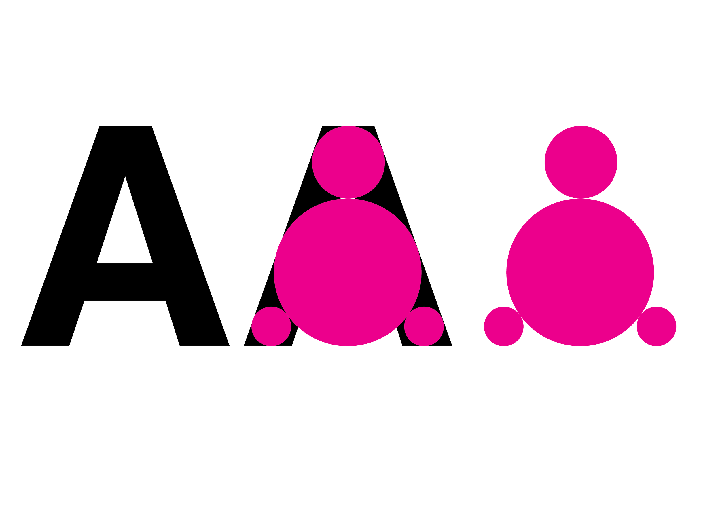
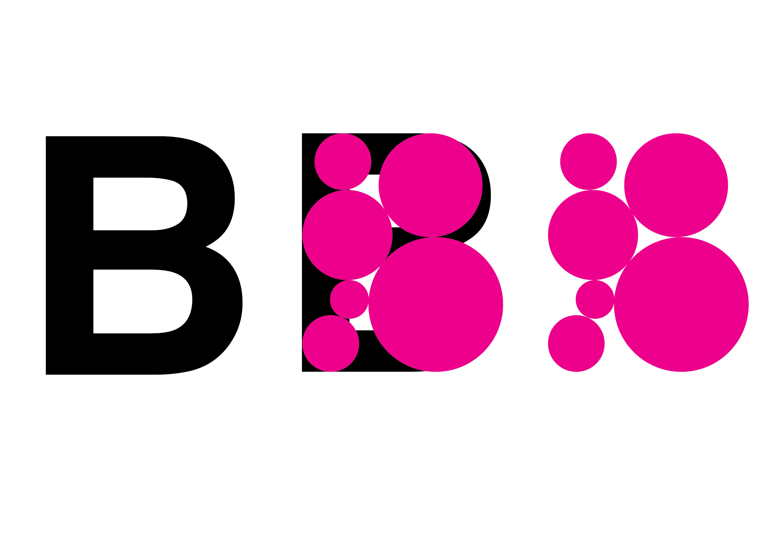
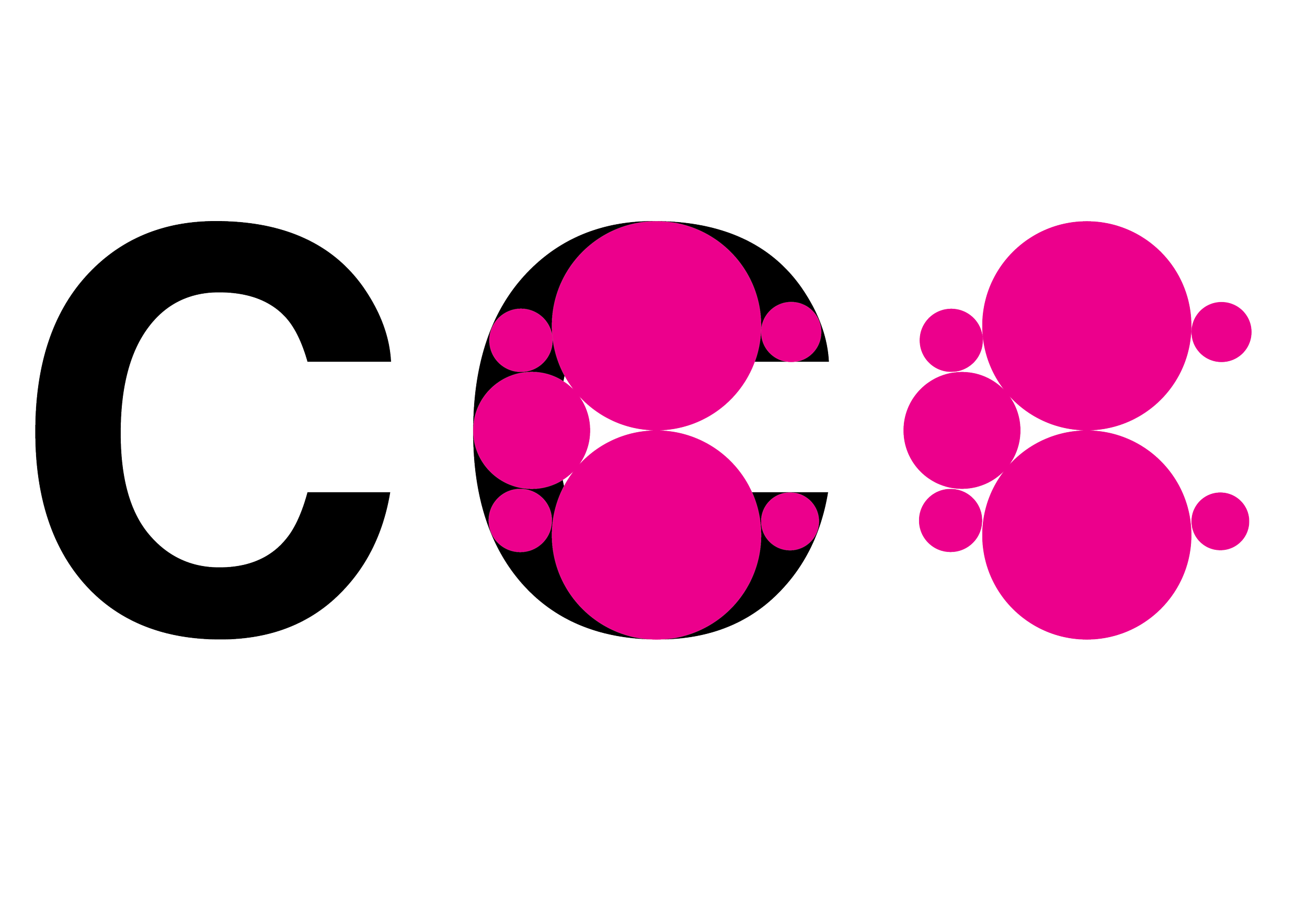
Recently, I’ve been trying the idea of slowing my processes down. Inspired by the hidden structures we stumble past every day, the way bubble wrap folds into a box, architectural rivets line a beam, or steam settles on a grid, I wanted to build a typeface that isn't just read, but played with.
The goal? A typographic system that challenges where a letter’s architecture ends and pure geometry begins.
The System: Deconstructing the Alphabet
Instead of starting from scratch with vectors and Bézier curves, I took standard, heavy glyphs and began filling their internal frames with vibrant pink circles. The experiment quickly became a study in how elementary, atomic shapes can redefine familiar forms, and how negative space can hijack positive structure.
When you break down the letters, their personalities completely shift:
The 'A' (Gravitational Anchor): Look at the A. Two larger spheres sit like heavy anchor points at the base, creating an almost physical sense of mass. Smaller spheres mark out the apex and joints. Suddenly, a rigid, triangular letter feels buoyant yet firmly grounded.
The 'B' (Cellular Growth): With the B, the circles cluster tightly within the counters. The arrangement mimics an organic, cellular packing, like fluid pressure pushing back against the heavy vertical stem. It softens the letter’s blocky posture.
The 'C' (Chain Reaction): By the time you reach the C, those same spheres trail dynamically along its open arc. It transforms a static curve into a sequence in motion, looking less like a character and more like a particle reaction unfolding in real time.
Why the Mundane Matters
This project started as a simple observation of the mundane: how basic geometry quietly assembles all around us in the built environment. But translating that observation into typography unlocked a broader framework.
By stripping away the solid black mass and leaving only the circle clusters (as seen in the right-hand figures), the letter doesn't disappear—your brain still reconstructs the A, the B, and the C. The shapes influence the letters, but the idea of the letter continues to govern the shapes. It’s a constant tug-of-war between structure and spontaneity.
What’s Next?
I’m still early in the process. Isolated letterforms are easy; scaling this logic across a full character set, kerning pairs, and text blocks is the real challenge. Right now, I’m pushing the alphabet to its limits to find the tipping point between legibility and pure abstract shape. Simultaneously, I've been running early prints through the Risograph to see how mechanical quirks and misregistration alter the form.
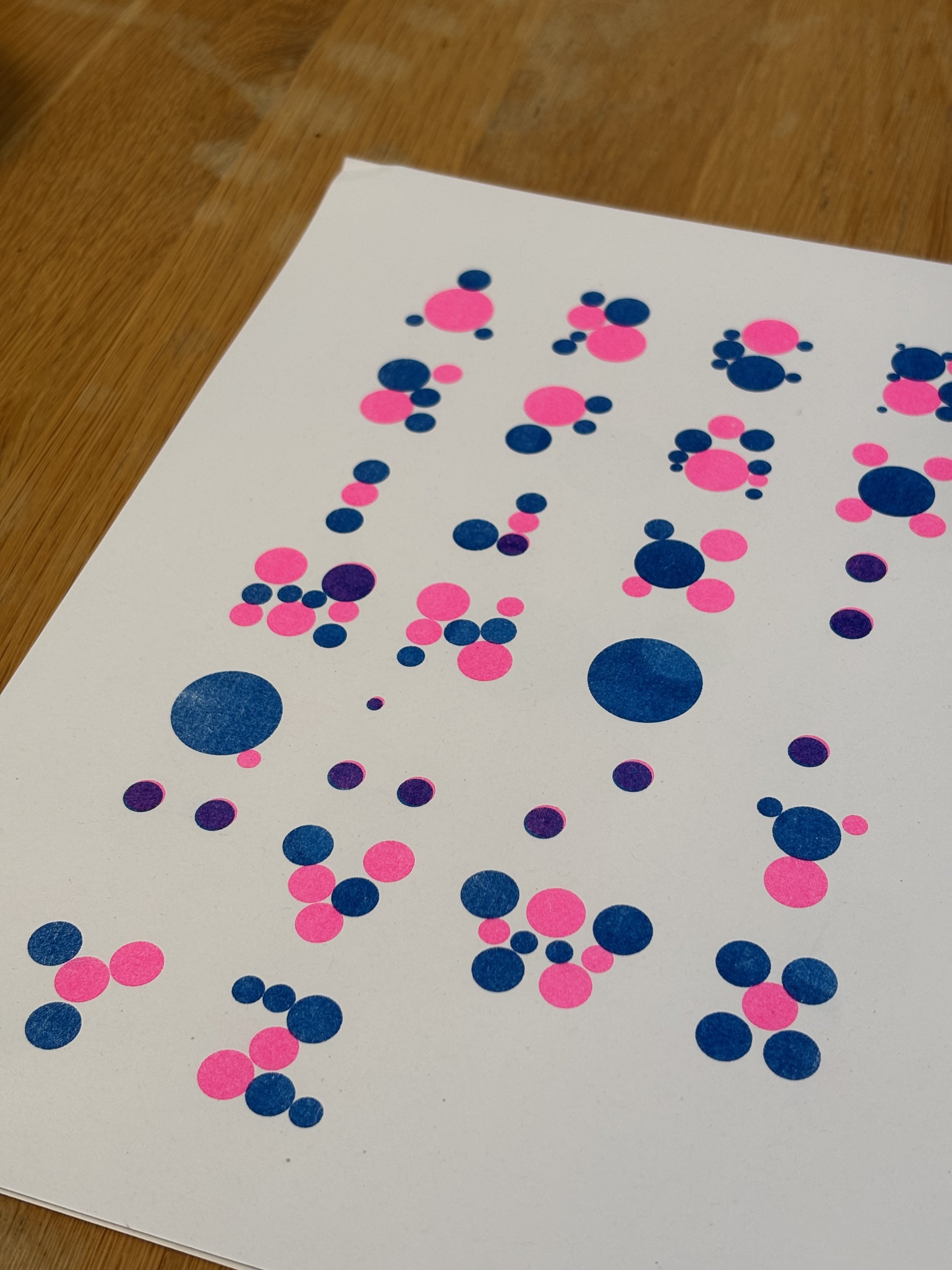
WIP…
It’s evolving, hopefully my next post will be the completed typeface.
Cheers, A.
